Kiviat Charts the Best Black Box Graphical Tool for Problem Identification
Kiviat charts are versatile graphical display tool which presents different metrics against maximum & minimum benchmarks.
Kiviat chart consists of radial lines representing a particular metric. Every metric is drawn to a suitable scale; wherein maximum & minimum values are represented by outer & inner concentric circles.
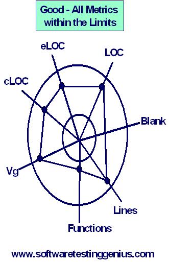
In the charts shown below the outer circle is the maximum threshold and the band is the minimum threshold. The band between the two circles is the acceptable range.
A Sample of Kiviat Charts for Development Code Metrics for a web application is presented below:
All metrics falling within the acceptable limits are represented by the following chart.
Good Kiviat chart showing all metrics within limits:
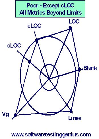
On the contrary, the following bad
Kiviat chart indicates all but one (cLOC) of the metrics outside the high limit:
Advantages of Kiviat Charts:
1) Kiviat Charts are helpful in providing an effective visual or graphical representation of problems or concepts quite complex in nature.
2) Kiviat charts are helpful in providing a sharp attention to the vulnerable areas needing a quick focus.
3) Various problems or concepts can be presented graphically by customizing the scale of the Kiviat charts to suit the individual needs.
Need of the Concept of Balance in Kiviat Charts:
Let us consider a problem having multiple dimensions like the following:
1) Computer : having processor, printer, disks, CDROM, modem etc.
2) Software
3) Personnel
All the above when put together, create multiple dimensions and hence the concept of having a balance is needed.
Method of creating Kiviat Charts:
Kiviat charts are usually drawn by using the following steps:
Step – 1: Choose factors to be measured.
Step – 2: Define factors so that for half the optimum utilization is 1 and for half 0.
Step – 3: Mark of the factors around the chart so that axes with an optimum of 0 alternate with those with an optimum of 1.
Step – 4: Mark of the values on the factor axes.
Step – 5: Join the marks to form a “star’.
Step – 6: Evaluate the result.
We shall now consider four different cases to draw Kiviat Charts.
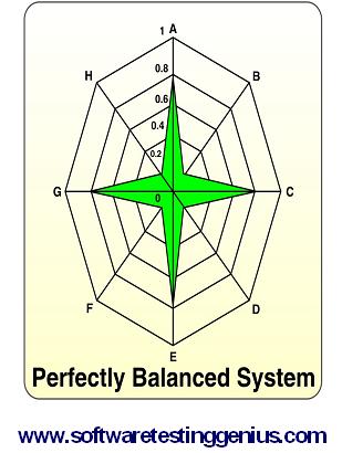
Case 1: Kiviat charts – A perfectly balanced system:
Consider a sample data given below.
A = 0.8
B = 0.2
C = 0.8
D = 0.2
E = 0.8
F = 0.2
G = 0.8
H = 0.2
It’s Kiviat chart is also shown below
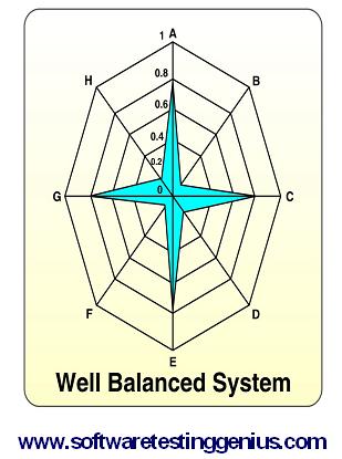
Case 2: Kiviat charts – A well balanced system:
Consider a sample data for a well-balanced system as given below.
A = 0.9
B = 0.15
C = 0.85
D = 0.2
E = 0.9
F = 0.1
G = 0.8
H = 0.2
It’s Kiviat chart is also shown below
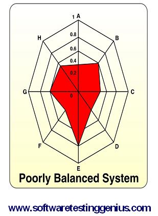
Case 3: Kiviat charts – A poorly balanced system:
Consider a sample data for a poorly-balanced system as given below.
A = 0.4
B = 0.6
C = 0.5
D = 0.4
E = 0.7
F = 0.4
G = 0.6
H = 0.5
It’s Kiviat chart is also shown below
Case 4: Kiviat charts – A perfectly balanced system:
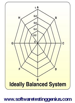
Consider a sample data for a perfectly-balanced system as given below.
A = 1
B = 0
C = 1
D = 0
E = 1
F = 0
G = 1
H = 0
It’s Kiviat chart is also shown below
Many More Articles & Tutorials on Black Box Testing

An expert on R&D, Online Training and Publishing. He is M.Tech. (Honours) and is a part of the STG team since inception.
